|
Film Title: Insidious
Release Date: April 21, 2011 Director: James Wan Production/Financing Company: Alliance Films and Stage 6 Films Principle Cast: Patrick Wilson, Rose Byrne, Ty Simpkins, Barbara Hershey, Lin Shaye Insidious is an independent American psychological horror film. It is written by Leigh Whannell. The story centers on a couple whose son inexplicably enters a comatose state and becomes a vessel for ghosts and demons. The trailer comes under the psychological/supernatural sub-genre of horror. This focuses on possessions and dark forces, usually through ghosts or demons. Insidious is a movie from the makers of paranormal activity and saw and so shares a lot of the same ideas that they have established in their past movies. The trailer uses a lot of dark imagery, the scenes used look gray scaled to give it a dull look and trigger unhappy emotions and feelings of stress whilst watching it. The trailer also practices the use of flashing images to give it a jumpy out ofyour seats look, whilst showing as much as possible in the given time of a teaser trailer. The teaser trailers flashing images makes sure that the viewer is seeing as much scenes as possible and are also seeing the shots that will make them go out and watch the movie.
In the trailer the main character Dalton is portrayed in his alright state before the accident and his unconscious state. Dalton is a young boy that is no older than 11 but no younger than 9. The mother and father of the main character Dalton is included in the trailer, they are a young couple and look in their late 20s, early 30s. It is suggested that they are his parents through how much worrying they have done and also sticking with him through his scenario. The final person depicted seems to be a ghost hunter or something along the lines, you can see this as she explains to the family what the real issue is. Usually in these movies the cursed are always usually children, they portray innocence and are believed to be a large target to corruption.
The sound running throughout the trailer is diegetic and put in
prior to making it; these sounds are haunting wails, screeches and distant screams which are played throughout the trailer and correspond to the actions and goings on at that point. The music definitely builds tension and adds to the intensity that is already built, the music also matches the very fast pace and music although dull is upbeat and plays an important role when complete. The film is being distributed by film district that are a leading independent distribution, co-production and feature film financing body, designed to bring profitable films to targeted audiences. They also brought to us “looper” a thriller which is a sub-genre that can also be described as horror in a certain way and “don’t be afraid of the dark” which is another horror under the sub-genre of monsters. This suggest film district dispense horror movies although most are veryoriginal and they do not always stick to the same genre. Trailers aim not to give you a lot of information about the movie or to show you much footage. Though there are usually sites for the movie which will give you more information on what the movie is about and a brief synopsis on it. |
Synopsis: A mother and father have recently moved into a new house, they have three children, one of the children whilst exploring the attic of the new home falls into a coma and doesn’t wake from his sleep. After returning from hospital three months later still in a coma disturbing events begin to occur. The mother believes the house is haunted after hearing other people in the house although the son in fact can astral project whilst sleeping and tormented souls seeing this lifeless body the boy has left behind consume a body in a crave to live life again.
The lighting in this movie is very dark and no
scenes have bright colors in them, if natural light is used it is very dull and the shot is misty looking. The characters never have smiles or have happy emotions, from the start of the trailer all actors are very serious and make the viewer’s feel that stress is being built in the trailer. The actors body language definitely show worry and fright, although we aren’t shown much about what is going to happen in the actual movie, we can see the characters are definitely worried about a possible problem. The setting is very bland, the home of the family although not shown a lot isn’t homely and has the most limited of furniture. The bedroom and other rooms shown have all of the basics these places would need and therefore doesn’t seem like they have had time to live in their home. A shot of the house is shown in a scene and although it looks like a house that you would work hard to live in, the dark shadows and the trees growing around it, with the one light being shone on the doorstep suggesting a presence, isn’t somewhere I would want to live. The teddy which is pictured next to the unconscious child lays lifeless as tubes run in and out of the child’s nose. These props are there to give the location of the shot, which is in his bedroom, suggesting the innocence of the child and lastly showing the condition he is in. The story is told through speech and dialogue between characters,
for example the characters will say little things that will give away parts of the storyline and briefly suggest what’s going on in the actual movie or give a brief summary on what the movies about. In the trailer the mother and the person who can be described as a ghost hunter or exorcist have opinions on what is the problem going on. The Mother says “he is not in a coma; I don’t know what to call it”, whilst the ghost hunter says “it’s not the house that’s haunted it’s your son” this implies not only is there a haunting but it’s a possessed child which will probably attract more people to the movie, and make a lot go to watch it. 
|
Movie Poster
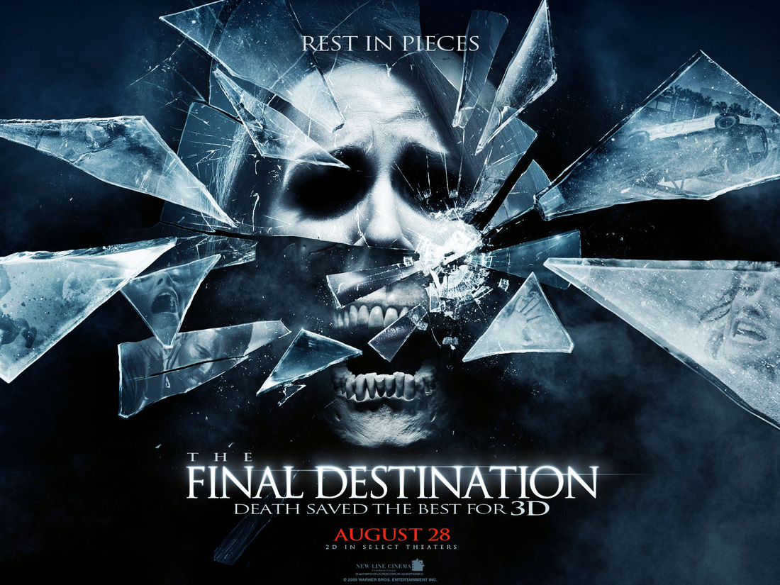
Film Title: The Final Destination
Year of Release: 2009 Director: David R. Ellis Production/Financing Company: New Line Cinema Principle Cast: Bobby Campo, Shantel Van Santen, Mykelti Williamson The movie poster uses general conventions in getting its point of horror across, the movie poster although still using the same color schemes of other posters like it, looks more futuristic and the original photo has been photo shopped to give us brief information of what the movie will be about. The use of the advanced poster may be because the movie was the first filmed in 3D and this could get that point across. The movie poster is very dark and the use of skeleton bones and shattered glass make us understand the movie will include accidents and possibly death.
From the photo on the movie poster front cover, you can see that it highlights a dark mood and raises a frightened emotion, which will probably be followed by the death of a character. The woman pictured on the poster is in a close up shot, the lower half of her face is part of the skeletal frame on the face, the other half of her face although still including the flesh and skin has no pupil and sclera visible, instead replacing it is darkness. The effect of shattered glass has been used at the upper part of her face and it looks like the woman pictured had looked into a mirror screaming before it was smashed to pieces. The majority of the photo is dark whilst in the lower right corner is smoke, giving a misty look. The woman is clearly screaming which you can see through the positioning of her mouth whilst she is very anxious with the muscles in her head bulging. This movie is suggested to be very grim through the imagery shown on the movie poster, the dark and slightly disturbing images definitely intend on arousing fear and terror. Viewers of this movie magazine will definitely have an idea of what sort of movie this is and will also understand what they will be in on when going to watch it.
|
The final destination is a supernatural horror sequel to the franchise final destination, this movie can be also called final destination 4, being the fourth installment and is currently the highest grossed sequel being shot in HD/3D and making 186 million dollars.
Synopsis: The
main character nick a student at college watches a race at a speedway track,
whilst watching the race nick has a premonition in which a number of people die
following an exaggerated crash. Nick panics and persuades his girlfriend and 8
other characters to leave before nicks vision becomes a reality and everyone at
the speedway track dies though the escapees survive. After the incident nick
researches premonitions to find in previous disasters all survivors have died
prior. Nick then realizes death didn’t mean for them to survive and is now
coming for them, the adventure begins here.
The poster has no names included on the front page and although a face is in view it has been dismembered beyond recognition. I believe this is because this movie doesn’t rely on big named cast to sell their movie but over the years have seen horror movies don’t need stars to make people go out and watch it. This is why so much has been put into the movie poster front cover to propose that the movie will actually be scary and dark.
Final destination is written in white on the darkest part of the image this definitely makes writing stand out and highlights the title. The words final destination has light shone through it and is in bold serif letters. The word “the” is on top of the other words and is more smaller, making us aware that it is there although not making it as vital as the other words. The phrase “Rest in pieces” is at the center of the poster at the top of the poster, this is written in white fairly large and definitely suggests a lot. The phrase will suggests to viewers that the movie will be a horror movie; a play on the commonly used phrased rest in peace will definitely imply that death will be involved whilst the addition of pieces could hint accident or disaster. This catch phrase acts as a tag line to the movie and adds more to what the movie will be about, whilst still not giving away too much. This phrase definitely adds anxiety to the poster which is definitely regular in a horror movie; although it doesn’t really have your adrenaline beating like other horror posters aim to do.
|
Movie Magazine

In the top left hand corner is the date, just above the “M” in the masthead, this was sold on December 2009, and this is just the month and year, therefore showing no day or actual date. The price is also located in the same place underneath the date which says 8 dollars 95 possibly suggesting it was distributed in America. The writing is white on a dark background which highlights it making it stand out, although smaller than some of the other writing it is still important, which is why it is written on the front cover and in a viewable place.
|
From the first looks of the movie magazine I can see the image of one of the characters in the movie; this image is taken as a close up shot of his face, whilst he is slightly turned to his left side where you can see his abnormal bushy sideburns and his very pale cheek. The light is being shown on his right, making the right side of him slightly lighter and highlighting certain characteristics that may want to be outlined. The left side of his face has a shadow covering it and is darker; his body language is very mysterious and unusual although human he doesn’t look ordinary. Behind the photograph of the person is a black background, the characters pale face stands out a lot on it. The masthead reads empire; it is written in a sans serif font, this in large red letters and positioned in front of the image. The writing is bold and is outlined in white so it is highlighted more on the black background. The way the masthead is written helps to make the magazine unique whilst building recognition. This is vital as it may be used for advertising and branding purposes and need to be identified. The image of the character in twilight has been used in a close up shot, showing his face large enough to fit the whole cover. This is not able to be missed and fans of the movie will definitely see it whilst looking at the magazine or looking round the shop. The model makes full eye contact as if he is looking at you and this could make customers believe the character is interacting with them
The magazine cover has the name of the movie written in large, bold, sans serif writing. This is central although in the bottom quarter of the page, the movie title takes up a lot of the front cover and on top the words fantastic exclusive with an exclamation mark is written. This suggests that the headline is a very important one for fans of movies or this film, fantastic exclusive although not largely written is in white writing within a red box and once reading the movie name the writing on top isn’t able to be missed. Under the words twilight: new moon is the name of the characters which movie fans will be very fond of. The words Edward, Bella and Jacob Interviewed! Is displayed in white on a dark background in order for it to be highlighted, it is in capitals and also a sans serif font. The writing is medium and bold; this is written straight across and followed by exclamation mark.
This is an empire magazine with the movie twilight on the front cover. This movie comes under the horror sub-genre of vampires/werewolves; this movie has been very successful at the box office and is currently on their fourth sequel. Although empire magazine doesn’t really have horror movies on their front cover a lot, the twilight magazine cover is the closest you will get to it and definitely apply some of the usual conventions.
|
