|
Synopsis: The main protagonist of 'THC' otherwise known as Laurence R. Harvey, stage name ' Martin Lomax', is a mentally disturbed lonely middle aged man who still lives with his mother. Like any normal lonely man living with his mother he works night shifts as a security guard in a grim and foreboding underground parking complex. This parking complex is an excellent place to carry out his cruel and abnormal experiment. Martin abducts his victims from the car park and uses them to build his own human centipede. He does this by knocking them unconscious and binding them together with tape and taking them to the warehouse. As simple as this may sound, the way in which Martin does this sends excruciating pains down spines. As the film goes on, audience are left to wonder whether the events witnessed actually took place in reality or happened in the subconscious of Martins mind.


There is a reason to why the trailer does not reveal the country, city, town of where this event is taking place. I believe the reason for this is to build up suspense and make the audience feel as if this could be happening in the warehouse just down the road. Everyone tends to know an old lonely man whether living with his mother or not.
Its almost like the producers are making the audience feel that the lonely man they know could be the man doing all of this. The only place show is the bleak house and the warehouse. Once again implying to the audience that this could be happened anywhere around the world. Even on front of their door step. 
The main theme of the trailer would be distrubance. To make the audience feel distrubed. As soon as the trailer beginnings an image of a females face attaached to someones rear end is show. She also looks like she is struggling to move.
Because it uses body parts it has an connection with the audience ( as everyone has this part on their body) and it makes them think, what if this was happening to them. Another theme in this trailer could be hope, as the frist shot in the beginning of the trailer is a close up of two people interlinking hands together which shows a sign of helping or comfort. |
Release dates :
Fantastic Fest: 22 September 2011 United States: 7 October 2011, United Kingdom: 4 November 2011 Running time: 91 minutes. Certificate: 18. Director : Tom Six ( a Dutch filmmaker, best known for his body horror films) Producers: Tom Six and llona Six. Studio: Six Entertainment Company. Distributed by : United Kingdom: BountyFilms, United States: IFC Midnight. Cast: Laurence R. Harvey as Martin Lomax, the main protagonist Awards/Nominations: Fangoria Chainsaw Awards - Best limited - release/direct-to-DVD film: 2012 Box Office: $141,877 KEY: 'THC' stands for ' The Human Centipede' 
The trailer lack dialogue throughout the trailer. The only time we hear someone speaking is when the 'mad doctor' explains his project to his victims. We also hear the mother talking to the protagonist about a 'porno' her son has been making. Other than these few words the audience hear, throughout the trailer all we hear are the screams, moans and heavy dropping of instruments which may have been used to attack his victims. This has been deliberately created to keeps the audience in suspense, leaving them wanting more so they will go and watch the film.
Like all types of films 'THC' has a genre attached to it. I personally believe that 'THC' is a cross-breed between many genres. For example THC could be classified as a psychological film because of the disturbing images and the way it makes a person think. It almost 'messes with our minds' which is the aim of a psychological film.
Although it can also be classified as a slasher/ boldly horror for its explicit scenes and the lack of dialog. My own understanding of a bodily horror is basically where the film uses body parts to create disturbance of audience. For example hearing/seeing an arm 'crack' can make you feel uncomfortable. Many review websites have classified THC as a cross-breed between horror and drama. 
Martin Lomax. who is the main protagonist of THC is a lonley middle aged man. This is represented effectivly as in society today and especially through the media the sterotypical lonley middle aged man is normally caucasian, over weight and has a constant dull 'abnormal' expression on his face.
The tone in which the female shouts at Marin Lomax shows that she has superiority over him. Hinting that the woman is either his strict wife that does not let him do anything or his mother. At first, i was unsure whether the female was his mother or wife until i did my research into THC. There is a cut away shot from his mother arguing with Martin, to Martins face. Martin has a child-like expression on his face. This shows vulnerability and that Martin is less of a man. You are able to identify the victims as the way they are placed in the trailer shows they are helpless and vunerable. The vunerbility of the victims is also shown through shots. There is an high angle shot of the doctor looking down on his victims as he analyses his work 
Not only is the trailer imaged based, but every now and again text comes up on the screen.
The text is a serif font, placed on a grunge canvas. This could represent the stains on the lab coat which Martin wheres when around his victims. The text which comes on the screen are short and informative, and help reveal move the story along. |
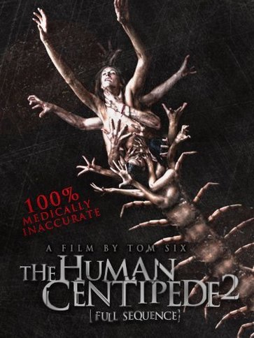
Tbe main colours used on this poster are red and white, which have been said to be the two colours which are conventional in a horror poster. The words '100% medically inaccurate' is in red to make it stand out to the audience. Also when you think about the medical field the thought of blood comes to mind. Therefore the colour was used to assoicate itself with what was written.
The only name featured on the poster is 'Tom Six' who is the director of THC. The reason that only his name is present on the poster is to show that his work is well know and brilliant that you should go and watch the film ask he was the person who directed it and you can never be dissapointed by his work.


|
Like all horror poster THC follows the codes and convetions in place to ensure that it looks like a poster for a horror film and not a comedy.
Conventions of a horror poster : - Consit of low light images to disguise the character - Colours black, red or white - One large image to grabe the attention of audience - If the image is not taking up the majority of space on the page, the image on the post would be a long shot of a main image to add suspence to the caption. 
The poster disguises the face of the character at the top of the centipede so you are unable to see her face. We know it is a female as we can see her long hair. The reason that the designer of this poster has made the audience unable to see her face, may be to give the impression that this girl could be any girl.
The image begins to form into a centipede as it goes down the chain. The human hands start to form into insect legs and the heads form into an insect body. It gets the auiennce thinking about how it happening and wondering how he did it.

The tag line for the poster is 100% medically inaccurate. This adds to the whole uncomfortable feeling of the poster. As anything in a health field show atleast have a pecentage of accurancy. It is almost to say the doctor is defying the laws of physics.
This poster is a teaser poster as it does not reveal any dates, cast etc. There are two version of this teaser poster I have found. This one, and the one below. Both poster do not contain the date for when this film will be out.
|

The masthead of this magazine is a serif font. The font has been choosen to replicate what is meant by the text. The title 'Fangoria' reminds people of vampires who have fangs. Therfore the letters in the masthead are long and pointy like fangs in a vampiers mouth. The use of a pale blue in the masthead matches with the image as the girl in the picture has a pale blue-like face as she stares blindly at the reader. The Masthead is placed in its own text box above the girl , give it its own space so everything does not look squashed in together.

The lighten of the image is low key lighting. This is to make the image more mystrious and more scary.
The NVC of the main character is highly effective. She looks posses as if she is about to come after the reader of the magazine. The pale blue shows that she is not herself and is effective as the horror genre is normally about when someone is not their self but have been taken over by something.
|
The image on the front of this magazine is an image taken from a shot in the film Silent Hill. By using a child it shows a sence of innocenece and vunrebiliy. The childs eyes are black showing that there is something wrong with a child. They have most problerly been possed by something or someone.

The main coverline is shown at the bottom of the page saying " The making of silent hill: relevlation". This cover line is refference to the image above. By using this main coverline and imagine is effective as it attract the reeader. Also the 'Silent Hill : Relevlation" in capital letters makes the reader want to buy the magazine to find out what this relvation must be. It must be very intresting for it to reach front page of the magazine.

The coverlines are all horror related. The coverlines have images on the top and the coverlines underneath. The images above the coverlines are used to explain what the coverlines mean. As if the coverlines where just there it may not make sence.
Also it is to give Fangoria orginality compared to other horror magazines. A bar code is used so it is possible for the buyer and retailer to identify the magazine and so it can be scaned for purchase. .

|
