|
Film Title: Storm House
Year of Release: 2011 Director: Dan Turner Production/Financing Company: Scanner-Rhodes Production Principle Cast: Grant Masters, Patrick Flynn and Grahame Fox Films Origin /info: It’s not a franchise or based on any true life story Synopsis: a couple months before the invasion of Iraq, they are collected a supernatural entity at the Stormhouse. The government bring in Haley sands , a ghost whisper to communicate with the entities however Haley’s presence trigger a series of incidents with the entities escaping from the Stormhouse. The film is a document of the last four days of the experiment. Genre: Horror but the sub-genre is a cross between Possession and Slasher The location of the film is in the Stormhouse. There is a voice over/ song throughout the trailer. It sounds like a female singing a French nursery rhyme. However the rhyme is sang very slowly to synchronize with the pace of the trailer. The trailer pivots in, and the flow/speed of the changes. It speeds up and the nursery rhymes till stays in sync with the actions. After a black out the singing is paused and continued after two seconds in the same speed as in the beginning of the trailer. Alongside the singing was an accompanied orchestra of sounds to build up the tension and help highlight the main points of the trailer.
The trailer starts off by revealing the logo and name of the production company. Followed by some text that gives a very basic brief of what the Stormhouse is. This information has been placed in the beginning of the trailer and included in the trailer so that the audience understands what’s happening in the trailer.
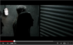
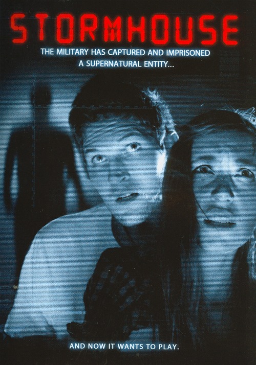
The first scene introduces the audience to the first character. Shes a female. They show her in front of a shutter being opened, beside her is a male but he is out of focus so the the attention and focus is on the female only. There is then a quick fade out and fade in into the next scene.
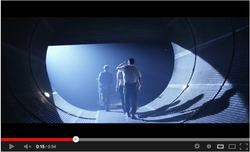
This scene is shot with a steady cam, you can see that the shot is stable and the camera movement is the same as the people walking. There are three people in this shot, the female and out of focus male in the previous shot and then we are introduced to a new character. He is a male also, there are all walking through an tunnel with a opening shutter at the end of the shutter. The tunnel doesn't have no light however there is a bright white light coming from the other side of the shutters.
|
A low angle shot of the female dropping on to the floor is the grand finale of the trailer and she gets dragged away by something that’s not visible. Every non-diegetic singing is cut off at this point and there’s only a loud sound that fades out, .Just when you feel the advert is over the singing continues but in a male voice with no ambiance or background sounds. This is significant because the trailer started off with a female singing and a male ending this may connote that the main protagonist/killer might be male. Or even more than one person. It may also signify the male taken over from the woman. The main character is a woman and she is a ghost whisperer, at first she’s in control of what’s happen but the switching of singer might show she no longer in control of the situation. The shots are connected by fade in and out to give the trailer almost like a blinking effect. It can also be looked at like a sideshow of events that take pace because each shot its quite short. 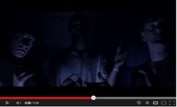
The advert includes a cross editing /parallel shot that continue within the trailer. There’s one scene of a group of three males, their faces are not really shown clear due to the navy low key lighting used. These males are clapping with a normal pace,however, the clapping gain intensity and gets louder and fast as the pace of the trailer exceeds also. The other shots that are combined with this scene to make it a cross editing, firstly is a low angle shot of a female running then falling on the floor. The lighting of this scene is the same as the scene with the clapping males. It then returns but to the clapping scene and rapid changes to the second cross editing scene. There are 3 more shots in different scenes. The next shot is also of a male that is tired up and has a cloth in his mouth. This man has blood around his mouth and eyes. This may connote that the man in the first scene is the person attacking these men.
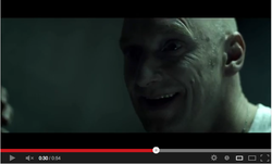
The first two shots are close ups of 2 different males faces, these to shots can even be argued to be eye line match shots, or seen as a point of view shot of the villain looking downwards towards the victim. This shot allows the audience to see the vulnerability within the victim. The first close up is of a man he has an evil grin on his face. This man seems to be wearing a doctors uniform and has a pale look to his face. He's grin seemed very unnatural and uncomfortable that makes his grin look evil or even psychotic. this shot is followed by the close up of an Asian man man tired up and there is a slight movement on the left hand side of his face as if a slug has crawled underneath he's skin. Even though its a close up shot and only his face is seen, judging by his non-verbal communication you the audience can tell that he has been tied up. the man has a cloth tied on his mouth, which I'm predicting is to top him from screaming or calling for help. The cloth this man has in his mouth has blood stains on it. Not only doe his cloth have blood stain but he also has a few blood stains and bruises to him face. This may suggest either he fought the person that tied him up and this was the consequence of losing the fight, or that the person that captured him is or did torture him.
the next scene is also a high angle shot of a Caucasian male straining, helplessly to look up as a flash light is pointed into his direction. The effect of the high angle shot shows that the view of the person is looking down towards the victim and that they are higher. this can also be viewed as a point of view shot with a combination of a mini canted shot . It then cuts back to the clapping scene with the 3 males, by now the speed of clapping has grown. Then there is a medium close of the same male in first part of the cross editing. He is also grinning in this shot, however, there is a pale blue lighting coming from the left hand side of this shot rather than it coming from the top of the shot. This restricts the audience from seeing his whole face. Only half of his face is shown. it then cuts to the a female, who this male is grinning at. We then see a reaction shot as the male shouts at the woman and she jumps back and then the males face is seen again. His facial expression if very different from when he is revealed in the previous shot. Hes face seems strained from the snapping and the girl. The next scene shows the Asian man who now has a bandage round his head There is no longer blood on his face. This shot is a opposite angle of the shot he was previously in. In this scene his shown from a low angle shot, which may suggestion that he is now higher and no longer in a vulnerable state when showed in the high angle shot. Hes holding a prop that goes with the shot angle. Hes holding a gun which makes him seem in control. He fires the gun He's non-verbal communication shows that he is merciless of whatever it is that he has just shot at. Almost as if he shot the gun with anger. The next shot isn't like the other shots, in fact, its the only shot like this within the whole trailer. The shot has the camera number and time and the bottom left corner. This shows that this shot is from a CCTV footage. Not only does the camera number and time show that the footage is a CCTV footage, the angle at which the shot is shown at also suggest this. In this shot we see the reaction of what the Asian man shot at, however, there is no one in the room. The location of this shot seems to be in a hospital room, on the side table there are hospital instruments. The shot is fired and a pool of the blood is on the floor and the instruments is thrown on the floor but there is no one in the room However if you look closely there are people underneath the hospital big however that's not who was shot. It then goes back to the clapping scene, then to the girl on the floor that fell on the floor. The trailer ends by her being dragged into the darkness then the title of the movie is revealed. |

The title has been written with a digital hand writing. this supports
my view of the scene being seen through a CCTV camera. the writing
is written in red, this color symbolizes evil, death and blood that
may have something to do with the movie. The title of the film is written
in a digital font. This may connote that they are being viewed through
some form of technology. The pale blue light supports the idea of it
been seen through a CCTV camera
|
The non-verbal communication in the female character seems very uncomfortable and frightened. The woman is in front of the man and the man is holding her. This connotes the stereotype male authority role, of being the leader and being more masculine. He’s non-verbal communication doesn't looked as frightened as woman. However I think the non-verbal communication works anchor to shape what it is they want then audience the think/believe. This may also represent teenagers and their stereotypes in horror moves ‘the couple always stays alive’ or there always being an innocent good girl. In this case she looks very innocent compared to the male. He isn't has shocked and stunned by this person or image. Even though the image is a mid-shot of them, the males stance looks as if he is trying to pull back the female or holding on to her. There’s a shadow on the wall behind them. This shows that the two supposedly victims are standing in front of the villain. The image is very clear and obvious in a first glance because the shadow can be mistaken for someone following them.
There’s a blue low key lighting that the picture has been shot in. this blue low key lighting may suggest that the couple are being seen there CCTV cameras. This creates a sense of instability and uncomfortableness. The thought of someone watching them in their most vulnerable moments seem very disturbing.
If you look carefully at the image there is a graph crossing through the
males head horizontally and another going vertically. This graph
probably shows what coordinates the people on the camera are at on the
camera.
|
Magazine Textual Analysis
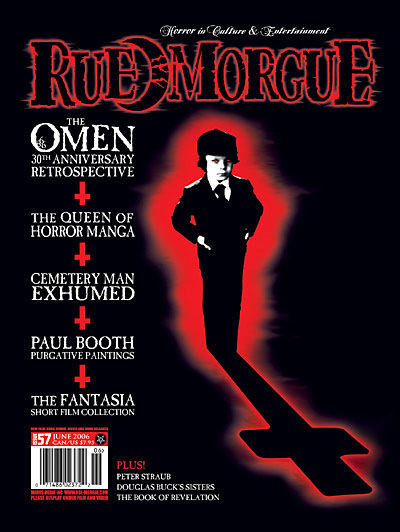
The Masthead: The title of the magazine is ‘Rue Morgue’ ‘however they have cleverly inserted and half-moon between the spaces of the two words. This moon connotes vampires. It connotes vampires because vampires come alive when the moon his coming up. It cans also connate werewolves also because people turn into werewolves during a half-moon. For both of these reasons the moon reinforces the genre of the magazine. It reminds people of what is associated with horrors such as the animals and monsters. The outline of the masthead is red. Not only does it going with the color theme of front page but it also add to the connotation of the moon relating to vampires. The font of the Masthead is very edgy and sinister, the outlines are almost smudged. It also looks as if it has the reflection of trees on it. This relates back to traditional horror clichés of old houses in the middle of the woods with dead trees and long branches.
The moon is also Rue Morgue's Logo, even though it seems like a very clever way to emphasis the horror theme, because they are a horror genre magazine they've chosen i very iconic symbol.
|
The Main Image
The image is of the famous 1976 image of ‘The Omen’. This image is similar to the posters of the movie. It’s of the main character ‘Damien’ standing with a red outer glow around him however his shadow reflecting on the floor of him is not his reflection but a cross which also has an outer glow. The influence of using the color red all leads back to the words associated with the color of red such fire and blood, so it is associated with energy, war, danger, strength, power, determination and evil. The image is in black and white but ‘Damien’s’ eyes are also red this connotes the evilness within him. It also contradicts with the stereotypes of children, especially in the media. They are often portrayed as the vulnerable, innocent and angelic beings; however, this child has been shown in a different light. The reflection of the cross can suggest that the movie has something to do with religion, without the symbol giving away too much of the storyline it shows that it isn’t a good thing about religion, due to the images and colors used. The cross is also upside down which is widely as an anti-Christ symbol, a meaning which is not valid with respect to traditional conventions of Christian symbolism.
Sell Line: Traditionally, Mastheads always have sell lines either at the top of the page of below. It this case it’s on the top of the page, sitting on the title of the magazine. It has an italic font. This maybe because the selling line doesn’t change, so this italic font maybe included in all issues.
The Headings: each topic is separated but the same symbol of the ‘anti- Christ’ cross. This is a good use of continuous theme. The color of the font is white, making the color scheme of the front page black, red and white. These colors can be associated with horror. The font is quite standard and bland; I think this is used because if it was written in a fancy font it will take the attention away from the main image and also the masthead. The blandness works well especially because there are no text on the other side of the page. The text is all on the left side of the page. The text is equally separated from each other. It starts off with the Tagline that is in sync with the main image; it reveals the name of the movie, and its purpose of it being on the front cover of the magazine. It then continues with the rest of the headings the give a brief of some of what the magazine features. It ends with a barcode, a tradition factor of a magazine, with the date of issue followed by price of the magazine in CAN/US Dollars. Beside the barcode is a puff, this highlights important features of the magazine. In this case the puff is about ‘Peter Struab Douglas book’. What makes this text different to the other headings is because of the change of front that introduces the topic. The headings on the left are all in white whereas this heading is in red, and says ‘Plus!’.
|
